In the ancient
Egypt building pyramids was a team work, now you can create a pyramid
on your own. Though you can't use it as a grave, what can be a
disadvantage...
First way
Starting point looks like this.
Right click the axis and select Edit Axis.
Tick Reversed
Drag the Measure Names to the Colour box.
=============================================
Second way
Starting point looks like this.
The data used in the tutorial are from
http://www.scb.se.
One measure should be negative, of
course I selected the measure for the negative change randomly... Click on the men and Create
Calculated Field.
Add the newly created field to the
Measure Values shelf.
Now you see a pyramid shape, ok it's a
bell, using data from Sweden wasn't the
best idea lol In demography bell is the new pyramid.
The negative values are visible and
annoying, number of men can't be negative, we need positive men on
this bell.
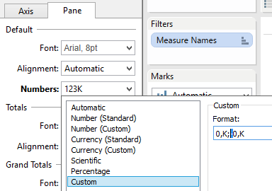
Delete the minus in both tabs, Pane and Axis.
Drag the Measure
Names to the Colour box.
Rename Men*(-1).


I like this type of visualization. A simpler way of getting the same result: In your starting point image, right click the axis for men, select "Edit Axis" and then check the option for "Reversed." This will avoid having a calculated field and formatting issues as well as simplifying any additional calculations you might want to do (such as table calculations).
ReplyDeleteRegards,
Joshua
Joshua,
DeleteThank you very much, I have edited the tutorial.